
Brand colour and logo
Pick one colour. Everything else is worked out from it.
By HeyThula · Updated
The widget takes your brand colour and logo and derives the rest — hover states, text colours, dark-mode variants. There's one colour picker, not a palette to manage.
Your colour
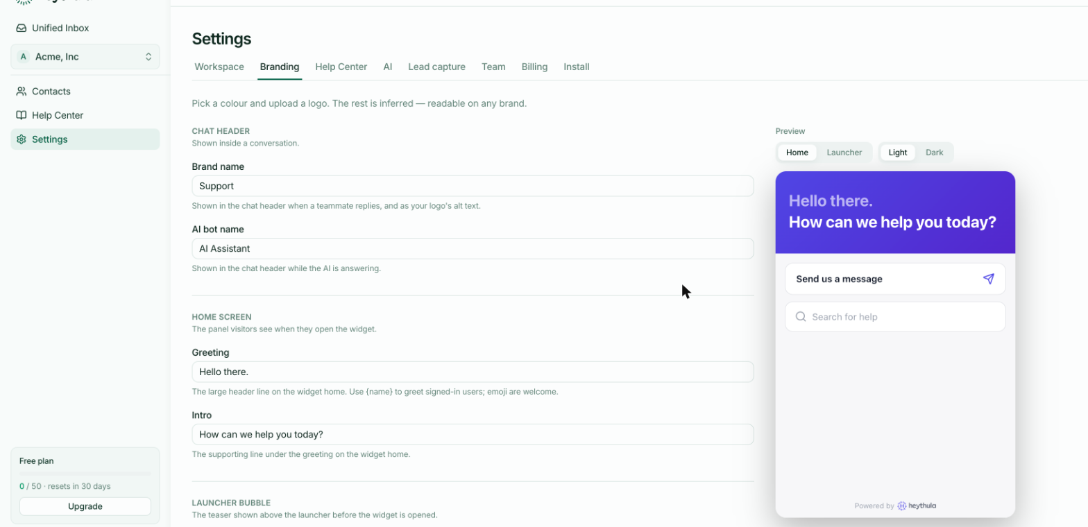
Set Primary colour in Settings → Branding. It's used for the launcher, buttons, your message bubbles and links.
Everything derived from it is adjusted for legibility. If you pick a very light colour, text on top is darkened rather than left unreadable; against dark backgrounds it's tinted instead of glowing. You can pick your actual brand colour rather than a version that happens to work.
Your logo
Upload under Logo. It appears in the widget header.
Roughly 5:1 and wide works best — around 500×100. A transparent PNG or an SVG sits cleanly on both light and dark backgrounds. Up to 2MB.
A square logo will be squeezed into a wide space. If yours is square, a horizontal lockup with the wordmark beside it looks considerably better.
Brand name is the fallback
If you don't upload a logo, your Brand name is shown instead. It's also the logo's alt text, so it's worth filling in either way.
Check both themes
The preview has Light and Dark buttons. Worth a look after changing your colour — particularly for very light or very saturated ones, which are where derived colours have to work hardest.
See Light, dark and automatic themes.
Changes take about a minute
The widget script is cached for around 60 seconds. If your site still shows the old colour, wait a moment and hard-refresh — see How long changes take to appear.